Neon signs look simple from the outside. A glowing phrase, a logo, maybe a shape.
But after working on dozens of installations for restaurants, bars, and commercial interiors, one thing becomes obvious:
Most neon signs don’t fail because of design — they fail because of placement and intent.
Over the past several years working on commercial LED neon installations across the U.S., I’ve seen the difference between a sign that becomes a focal point—and one that just sits on a wall.
This guide breaks down what actually works in real spaces.

1. Neon Is Not Decoration — It’s a Behavior Trigger
A lot of people treat neon like decor.
Designers think:
“Let’s add something glowing to fill the wall.”
That approach almost always underperforms.
In reality, neon works best when it changes how people behave in a space.
Real example (restaurant project)
We installed a custom LED neon piece inside a restaurant in Chicago.
It wasn’t just placed randomly — it was positioned directly behind a seating zone with:
- natural foot traffic
- clear camera angle
- controlled lighting
Result:
- people started taking photos there constantly
- the spot became an “unofficial photo zone”
- organic social media mentions increased
No ads. Just placement.
2. The Biggest Mistake: Wrong Location
Most weak neon installs have one issue:
They are placed where nobody looks.
Common bad placements:
- too high (above eye level)
- behind furniture
- in low-contrast lighting
- in corners with no traffic
What actually works
From real installs:
- Eye-level or slightly above
- Behind seating or standing zones
- Visible from entrance or main path
- Clean background (no visual noise)
If people don’t naturally face it → it won’t perform.
3. Neon Should Be Designed for Cameras, Not Just Eyes
This is something most designers miss.
A neon sign today is not just for physical space.
It lives on:
- Google reviews
- TikTok
- customer photos
So the real question is:
How does it look on camera?
What works on camera:
- strong contrast (light vs dark wall)
- readable text (not overly complex fonts)
- controlled glow (not overexposed)
- clean composition
What doesn’t:
- overly detailed shapes
- weak brightness
- cluttered backgrounds
In multiple projects, simply adjusting contrast and placement increased how often people photographed the sign.
4. Text vs Shape: What Converts Better?
From experience, both can work — but they behave differently.
Text-based neon
Best for:
- branding
- slogans
- identity
Example:
- restaurant name
- short phrase
- signature statement
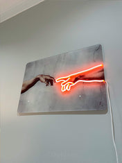
Shape / artwork neon
Best for:
- atmosphere
- visual impact
- design-focused interiors
Example:
- abstract forms
- outlines
- custom artwork
Hybrid approach (strongest)
What works best in premium spaces:
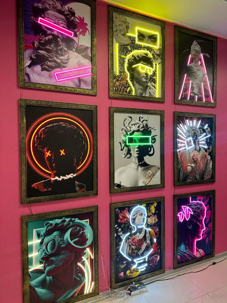
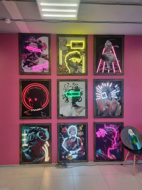
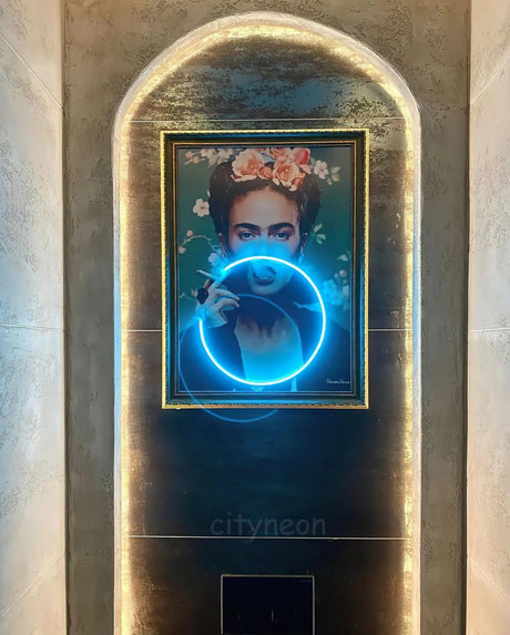
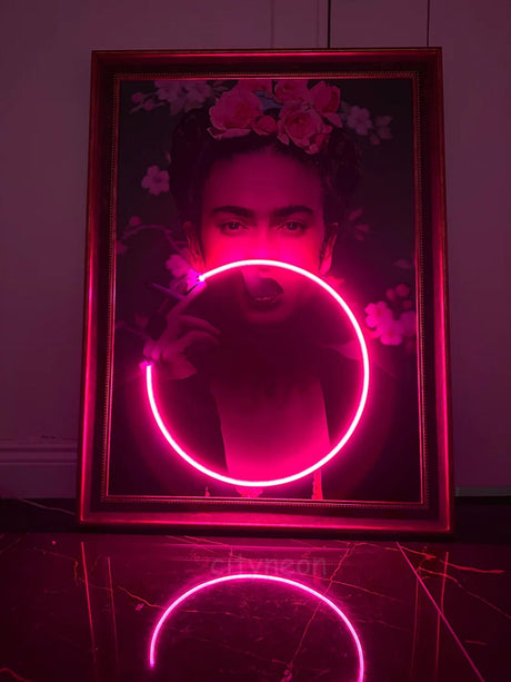
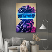
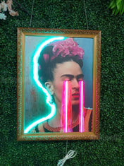
UV-printed artwork + neon accents
This allows:
- detailed visuals (print)
- emotional impact (light)
This approach is increasingly used in higher-end interiors.
5. The “Too Much Neon” Problem
There’s a point where neon stops looking premium.
Signs of overuse:
- multiple neon pieces competing
- too many colors
- no visual hierarchy
Result:
- space feels chaotic
- loses focal point
- looks cheaper
What works instead:
- one strong focal neon piece
- supporting lighting (not competing)
- controlled color palette
In most successful projects, less neon → stronger impact.
6. Residential vs Commercial: Completely Different Goals
In homes:
Neon is personal.
- quotes
- mood lighting
- artistic expression
In commercial spaces:
Neon is strategic.
- branding
- engagement
- customer behavior
- photo zones
Trying to apply residential logic to commercial spaces usually fails.
7. What Actually Makes a Neon Sign “Work”
After years of installations, it comes down to this:
A neon sign works when it:
- is placed where people naturally look
- is designed for real-world lighting AND cameras
- creates interaction (photos, attention, movement)
- fits the space instead of fighting it
Not just “looks cool”.

Final Thought
Neon lighting isn’t just a trend.
But the way it’s used has changed.
The difference today is simple:
Good neon decor fills space.
Great neon design creates behavior.
If you're planning a custom neon installation or want to understand what would actually work in your space, you can explore options or request a custom concept here:
👉 https://cityneon.us/pages/customform