Walk through any commercial street in Chicago, Milwaukee, or a smaller town in Illinois, and a pattern starts to emerge. Some businesses feel alive the moment you pass by. Others, even with decent products, seem invisible.
It’s rarely about the logo alone. More often, it’s the way light is used — or misused.
For many business owners, signage is treated as the final step. Something to install once everything else is done. In practice, that’s usually where problems begin.
Why Signage Fails in Real Businesses
In real projects, signage issues are surprisingly consistent.
What often happens is this: a business invests in a logo, prints it, mounts it on a wall, and adds lighting as an afterthought. The result looks acceptable during the day but disappears at night — or worse, becomes visually uncomfortable.
Common mistakes include:
- Wrong sizing — signs that are too small for the space or street visibility
- Poor placement — mounted too high, too low, or blocked by reflections
- Over-bright lighting — harsh LEDs that create glare instead of clarity
- Cheap materials — thin acrylic or uneven diffusion that breaks the visual effect
Expectation: a sign that attracts attention.
Reality: something people walk past without noticing.
In cities like Chicago, where visual competition is high, these details matter more than most owners expect.
How Lighting Affects Customer Behavior
Lighting doesn’t just make a sign visible — it shapes perception.
In practice, softer and more controlled light tends to perform better. A 3000K warm tone, for example, creates a welcoming feel for restaurants or salons. Cooler tones can work for clinics or tech spaces, but even then, balance is critical.
Too much brightness often backfires. Instead of drawing attention, it creates discomfort. People look away.
There’s also the issue of contrast. A sign placed on a reflective glass surface without proper spacing can lose definition entirely at night.
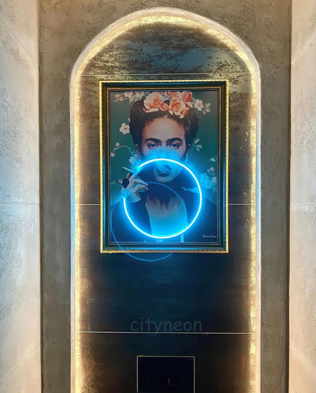
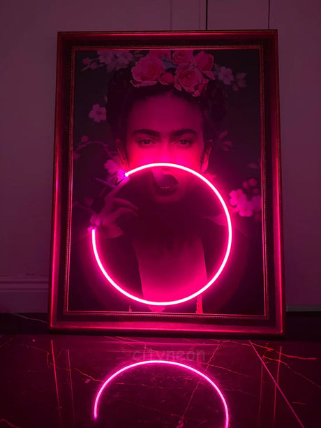
Studios working with modern neon lighting have started treating signage more like interior lighting design — thinking about depth, glow, and how light interacts with surfaces.
Some businesses in Illinois have begun integrating signage into their overall lighting plan, rather than isolating it as a separate element. The difference is noticeable.
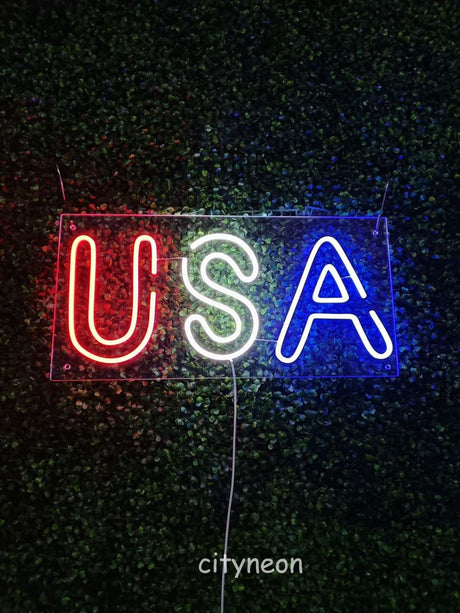
For those exploring more design-driven approaches, examples of custom neon signs for interiors show how signage can feel integrated rather than added.
 Permits and Regulations (Local Reality)
One part often overlooked is regulation.
In Chicago, commercial signage permits can be stricter than expected. Size limits, placement restrictions, and brightness guidelines vary depending on the district. What looks fine in a design file may not pass inspection.
Wisconsin cities have their own nuances. Some require detailed drawings, electrical specifications, or even material descriptions before approval.
What often happens is this:
A business orders a sign, installs it, and only then realizes it doesn’t comply.
Fixing that later is always more expensive.
From experience, it’s better to think about permits early — even at the concept stage. Not every designer accounts for this, which leads to delays or redesigns.
What Works in Modern Neon Lighting
There’s been a quiet shift from traditional glass neon to custom LED signs in the USA, especially in commercial spaces.
The reason isn’t just durability. It’s control.
Modern LED neon allows for:
- Consistent diffusion without hotspots
- Flexible shapes that follow design precisely
- Lower energy consumption
- Safer installation for indoor environments
But the material alone doesn’t guarantee a good result.
Mounting plays a big role. A slight distance from the wall — even half an inch — creates a halo effect that makes the sign feel intentional. Too close, and it looks flat. Too far, and it loses definition.
Acrylic backing also matters. Thicker, well-cut panels reduce visual noise and improve how light spreads.
Some studios, including Chicago-based CityNeon, approach this as a hybrid of signage and light installation — not just letters on a wall, but a controlled visual element within a space. Their modern neon lighting designs often show how subtle adjustments in spacing and tone change the overall perception.
Real Observations from Projects
In real projects across Illinois and Wisconsin, one pattern stands out: businesses that treat signage as part of the environment tend to perform better visually.
A café in Chicago replaced a bright white sign with a softer amber neon outline. The difference wasn’t dramatic on paper, but foot traffic increased — not because of marketing, but because people noticed the space differently.
Another example: a boutique store installed a sign directly on glass. During the day, reflections made it almost invisible. After repositioning it with a slight offset and adding controlled back-glow, it became readable from across the street.
These aren’t large changes. But they affect how a business is perceived within seconds.
Practical Advice for Business Owners
For those planning new signage or updating an existing one, a few points make a real difference:
- Think about distance first — how far away should your sign be visible?
- Avoid maximum brightness — balanced light is more effective than intense light
- Consider wall texture — brick, concrete, and glass all interact differently with light
- Plan placement early — not after construction is complete
- Check local permits before production
If customization is required — logos, brand colors, or unique layouts — it helps to work with providers who understand both design and technical constraints. Some studios offer custom LED signage solutions that account for these factors from the beginning.
 A Subtle Shift in How Businesses Use Light
There’s a noticeable change happening in how businesses approach signage.
It’s less about visibility alone and more about presence.
A well-designed sign doesn’t just say “open.” It communicates tone — calm, energetic, refined, or playful. It becomes part of the space, not separate from it.
Not every business needs complex lighting. But almost every business benefits from thinking about light more carefully.
Because in the end, customers don’t analyze signage.
They just feel it.