Most custom signs don’t fail because of poor materials — they fail because of poor decisions.
Over the past several years working on commercial signage projects for restaurants, retail spaces, and interior installations, one thing becomes clear: visibility is engineered, not guessed. A sign is not just decoration — it’s a tool that either attracts attention or gets ignored.
This guide breaks down what actually works when designing custom signs, especially LED neon, based on real-world installations.

Keep It Clear and Legible — But Think About Distance
A sign that looks perfect up close can completely fail from just a few steps away.
Legibility is not only about font choice — it’s about distance, lighting conditions, and placement. Thin script fonts or overly complex lettering often disappear in real environments, especially in dim or mixed lighting.
In restaurant and retail projects, the most effective signs are designed with a simple rule in mind:
If it’s not readable within 2–3 seconds, it doesn’t work.
This is especially important for storefront signage or wall installations meant to attract passing traffic. Clean typography, proper spacing, and enough visual weight make a measurable difference.
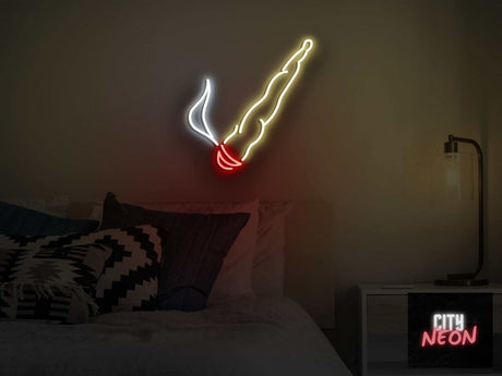
Design for Attention, Not Decoration
Many business owners approach signage as a design element. In reality, it should be approached as a visibility tool.
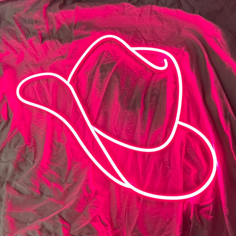
A well-designed custom neon sign doesn’t just “look nice” — it creates interaction.
In multiple restaurant projects, the most successful installations were not the most minimal ones, but the ones that naturally became photo spots. Customers took pictures, shared them, and turned the sign into organic marketing.
The best-performing signs are the ones people photograph — not just notice.
If your sign doesn’t create a reason for someone to stop, look, or engage, it’s not doing its job.

Organize Information — Less Is More
One of the most common mistakes in custom sign design is trying to communicate too much.
A sign is not a website. It doesn’t need to explain — it needs to register instantly.
In most cases, one clear message outperforms multiple elements competing for attention. This applies to both text and visual composition.
The goal is recognition in seconds, not explanation.
Reducing clutter improves not only readability but also perceived quality. Clean, focused designs consistently perform better across all types of spaces.
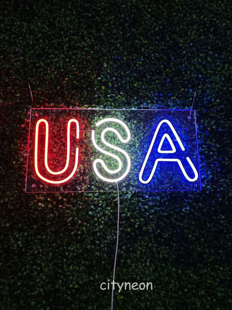
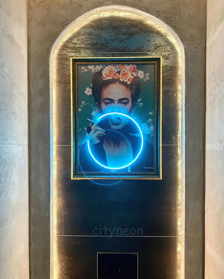
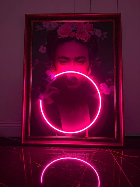
Choose Colors That Work in Real Environments
Color selection is often underestimated.
The same LED neon color can look completely different depending on:
- wall texture
- ambient lighting
- surrounding materials
For example, warm white neon on a textured concrete wall creates a completely different effect than the same color on a glossy surface.
In commercial interiors, contrast matters more than color choice itself. A bright neon sign on a light wall can disappear, while a softer tone on a darker background can stand out significantly more.
Color doesn’t work in isolation — it works in context.
Testing color against the actual environment (or visualizing it properly) is critical.
Size and Placement Decide Everything
Even a perfectly designed sign will fail if it’s too small or poorly placed.
Scale is one of the most underestimated factors in custom signage. A common mistake is choosing a size based on wall space instead of viewing distance.
In practice:
- small signs get lost
- oversized signs dominate and convert
Placement also affects visibility. Signs positioned too high, too low, or off-axis from the main line of sight lose effectiveness.
If you’re unsure how to approach sizing correctly, see our detailed guide:
→ How to Pick the Right Size for Your Custom LED Neon Sign
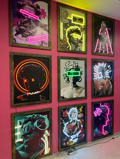
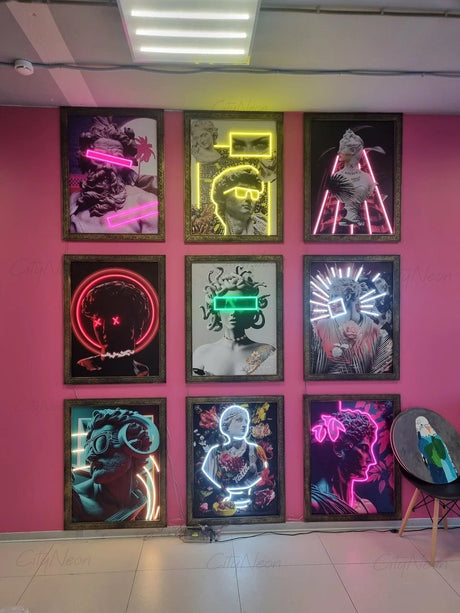
Why LED Neon Works Better for Modern Businesses
Traditional glass neon has its place, but modern commercial environments increasingly rely on LED neon — and for good reason.
LED neon offers:
- consistent brightness
- flexibility in shape and design
- safer operation (no fragile glass tubes)
- easier installation and maintenance
This allows for more precise control over how the sign integrates into a space — which is critical in restaurants, retail stores, and branded interiors.
Modern LED neon is not just an alternative — it’s a design tool.
It enables designs that would be difficult or impractical with traditional materials.
For a deeper look at how neon fits into interiors, see:
→ Neon Signs in Interior Design: What Actually Works
Context Matters — Especially for Local Businesses
Signage doesn’t exist in a vacuum. Local regulations, building types, and audience expectations all play a role.
In areas like Illinois and Wisconsin, factors such as:
- storefront positioning
- zoning considerations
- visibility from traffic flow
can directly impact how effective a sign will be.
If you want to see how these factors apply in real-world projects:
→ Why Some Signs Get Noticed — and Others Don’t: A Look at Modern Neon in Illinois and Wisconsin

Final Thoughts
Good signage isn’t about trends — it’s about clarity, placement, and intent.
The difference between a sign that “looks nice” and one that actually drives attention, engagement, and customers comes down to a few key decisions:
- readability
- scale
- placement
- context
When these are done right, a custom LED neon sign becomes more than decoration — it becomes part of how a business communicates.
Ready to Create Your Custom Sign?
If you already have an idea, you can send it to us — we’ll help refine the design, size, and materials based on your space and goals.